Other than the inbuilt elements of the Visual Composer, Aerious also played its part by creating custom built elements. They’re intended to save the time of users in creating a website in addition to enhancing the physical look of the website. Following 46 custom built Aerious elements are:
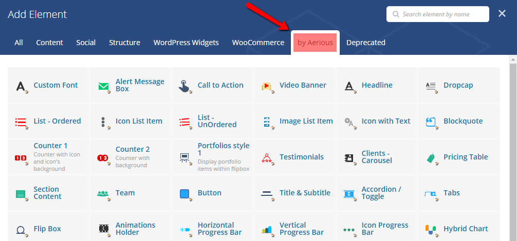
- Custom Font — This element allows the users to add custom font on the particular website section
- Alert Message Box — This element displays message boxes on the website
- Call to Action — This element let the user display call to action button
- Video Banner — In order to use the video banner, this element is vital
- Headline — This element shows the stylish headline along with headings
- Dropcap — It will allow the user to utilize dropcap effect on paragraphs
- List – Ordered — Displays elements along with ordered lists i.e. numbers
- Icon List Items — Displays elements along with icons i.e. elegant icons and font awesome
- List – Unordered — Displays elements along with unordered lists i.e. bullets styles
- Image List Item — Displays elements or items with user-uploaded images
- Icon With Text — Displays Icons i.e. font awesome and elegant icons along with custom text
- Blockquote — This element displays the blockquote on specific texts or paragraphs
- Counter 1 — This element displays counter with icon and icon’s background
- Counter 2 — This element displays counter with background only
- Portfolios Style 1 — This element shows the portfolio items within the flip boxes
- Testimonials — It will display the user-defined testimonials on specific website section
- Clients – Carousel — This vital element shows the clients carousel with its customizable settings
- Pricing Table — This element allows the users to employ pricing tables on their desired section
- Section Content — Allows the users to insert the texts or paragraphs on their desired section
- Team — This useful element particularly meant to insert the team or members on website
- Button — This element allows the users to use the buttons and to customize them as they like
- Title & Subtitle — Enable the title and subtitle on specific website or page
- Accordion/Toggle — This element displays the customizable toggle and accordion on website
- Tabs — This element shows the stylish tabs on the website
- Flipbox — Displays the aesthetic flip boxes
- Animations Holders — This element is used for adding the animations on other elements in it
- Horizontal Progress Bar — This element lets the user display the progress bar in a horizontal style
- Vertical Progress Bar — This element lets the user display the progress bar in a vertical style
- Icon Progress Bar — This element lets the user display the progress bar with the icons
- Hybrid Chart — This element allows the users to use hybrid chart and add your information into it
- Pie Chart — This element displays pie chart and lets the users enter their information
- Pie Chart 2 — This element displays pie chart with percentage style i.e. %
- Feature Box — This element displays feature box covering background, icon and text
- Opening Hours — Displays the lovely little section for opening hours depending upon the cause
- Google Map — This element allows the user to display google maps on desired sections
- Workflow — This workflow element in intended to describe the workflow of any project in a graphical representation
- Image Gallery — Permits the users to display image gallery with the images of their own choice
- Table — This element displays the table with the default design defined in the settings of this element
- Action Box — This element displays the action box including the title, button, and description
- Image Box — This element allows the users to use this styled image box showing the image, icon and hover effects
- WooCommerce Products — This element shows the list of products with the customizable style on the desired site section
- Teaser Box — This animated element displays the box with the image, button, title and zoom-in hover effects
- Portfolio Style 2 — This element shows the portfolio items in the lists
- Portfolio Style 3 — This element displays the portfolio items with hover effects
- Pie Charts Slider — Displays styled pie chart sliders upon using
- Blog Posts — This element displays the blog post items on specific website section and that can be customizable in terms of layouts
These elements can be customized easily. When you add any elements from the “Add Element” dialog box by clicking the add element “+” symbol from the visual composer page editor, another dialog box opens incorporating the necessary settings of that particular element. From there you can modify the settings of the elements. They’re very smooth and self-explanatory to deal with.
Leave A Comment?
You must be logged in to post a comment.