Responsiveness has always been the point of debate by the users for so long. Without any doubt, it’s been the critical factor to consider being the user, developer or the owner of the site.
More than half of world population uses the mobile phones. It’s vital to hold a responsive website that works accurately on various screens. Otherwise, it will be hectic for the users to use the website.
We are quite aware of the significance of responsiveness. We believe that a responsive website brings more traffic to the website. Therefore, Aerious has included a user-friendly interface for setting up the responsiveness of website without proceeding into the codes.
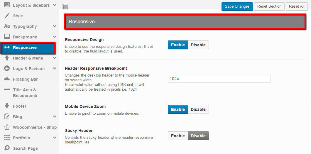
- Responsive Design — Enabling this option will use standard responsive design features for website whereas disabling will use the fluid layout i.e. page will size up in accordance with the change of window size
- Header Responsive Breakout — This option only works if “Responsive Design” option is Enabled. Based on screen width, this option transforms the desktop header to the mobile header. You’re required to enter valid breakpoint values depending on your needs
- Mobile Device Zoom — This option only works if “Responsive Design” option is Enabled. Enabling this option will allow the users to employ pinch to zoom option on mobile phone devices
- Sticky Header — This option allows the users either to display the sticky header or not on the defined header responsive breakpoint for different devices
There is an new setting in “Responsive” menu that there is’t any descriptions about it. it’s “Sticky Header”. Please write somethings about it and tell how could us use it. /Thanks
Thanks for your comment and informing us. It’s now updated. By enabling this option, you can display sticky header i.e. sticky menu on mobile devices and vice versa.